Insight
The tallest hurdle for architecture firms to tackle embodied carbon is to first start measuring. The fun begins after that when analyzing colorful pie charts and graphs! Architects tend to love beautiful diagrams after all.
We are sharing three strategies to measure, manage and present embodied carbon data. First things first, if you want to learn more about, or want a refresher on embodied carbon, the Carbon Leadership Forum’s (CLF) 101 Guide is a great resource.
Building nothing or building less, is the best way to reduce or, more importantly, avoid carbon emissions. But if you must build new, let’s talk pie …. specifically pie charts, and how to use them for owner engagement, carbon avoidance, and making an impact where it matters most.
Hotspot Comparisons:
Software such as Tally LCA can be used to conduct Whole Building Life Cycle Assessments (WBLCA) and will auto-generate a few comparison graphs to illustrate the global warming potential of certain building materials compared to the total carbon of the project. It is a useful starting point to highlight hotspots at a high level.

The above charts are a Tally LCA breakdown of the same project; material categories on the left and component types on the right. In this example, no one building material was significantly higher than the others. When organized instead by component type, the data starts to highlight carbon hotspots in the wall and floor assemblies. Wall assemblies here were responsible for more than 50% of the embodied carbon. By then utilizing the raw Tally data in Excel, we took a deeper dive into the carbon breakdown of the specific wall materials.

The three largest carbon contributors in the walls were painted gypsum board, masonry, and insulation. This analysis provided the design team with a direction for their research, focusing on options for low-carbon CMU, different brick or precast façade systems, and greener insulation. These lower-carbon swaps do not always mean a cost increase. The low-hanging fruit on this project was the acoustic insulation in interior partitions. It was a simple swap to use wood fiber insulation rather than mineral wool. Given the high number of acoustic partitions in this particular design, that one change made a significant difference.
The power of the pie chart lies in highlighting anomalies and hot spots, and targeting efforts. It is an excellent tool for comparing data to the project, but we use other graphics to illustrate the broader impact.
Carbon Quantities:
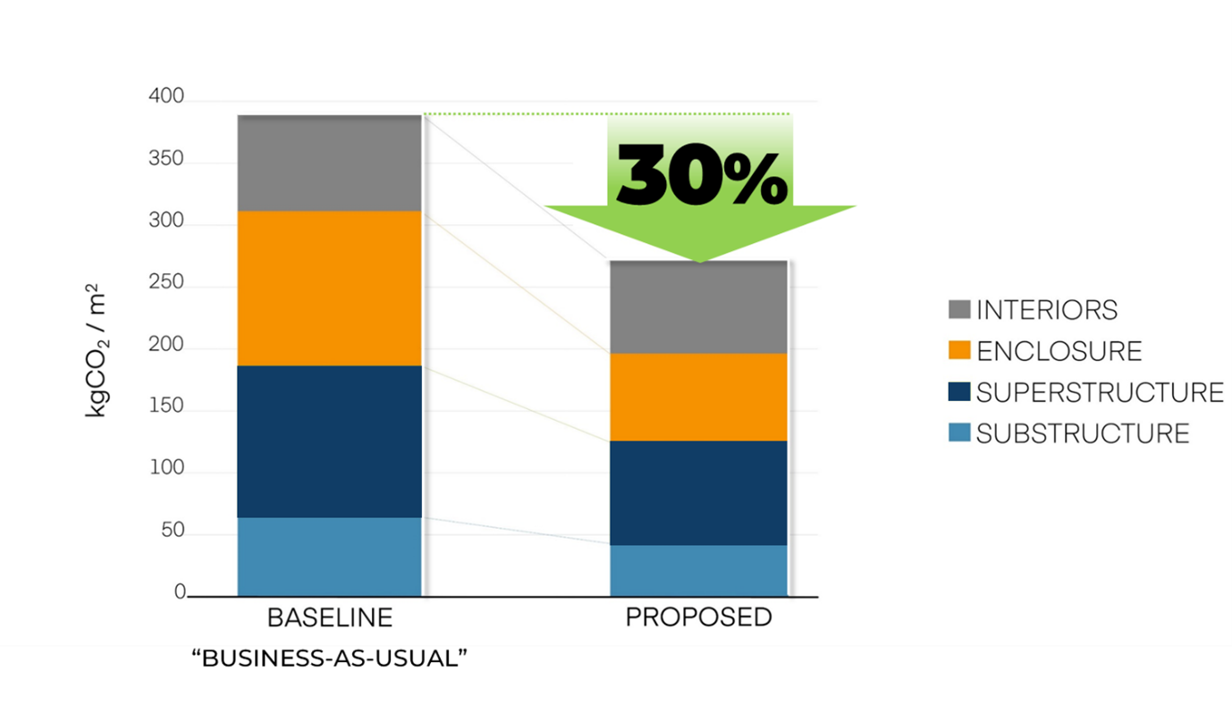
Stacked bar charts are a useful visualization tool to transition from comparative data in a pie chart to actual carbon numbers. These are particularly helpful when comparing to a baseline number. For green building certifications or zoning code requirements, a percent reduction from baseline is mandated. That requires analyzing two separate models: one with business-as-usual construction materials and one with the proposed lower-carbon design. Stacked bar charts can be powerful in showing the holistic impact of design decisions with real values of CO2.

Relatable Data:
While pie charts and bar charts are useful for highlighting hotspots and showcasing improvement, the data is not always digestible to building owners. What does 40,000 kgCO2e really mean? What is the real-life impact of selecting a certain structural system over another, or paying a 5% cost increase for lower-carbon concrete? To understand this, we try to make the data relatable.
The following diagrams illustrate some relatable comparisons when making decisions that would either increase or avoid additional embodied carbon.

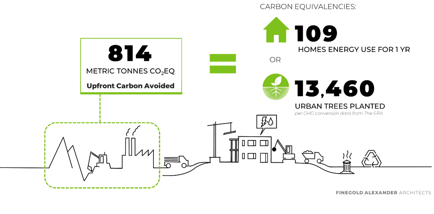
If we can do anything to demystify embodied carbon, promote avoidance, and celebrate even the little wins, then we, as a design community, are making progress.
So, tell us, what is your favorite embodied carbon visualization tool?
You may also like this
