Project

Harvard Law School Pound Hall
Client: Harvard University
Cambridge, Massachusetts
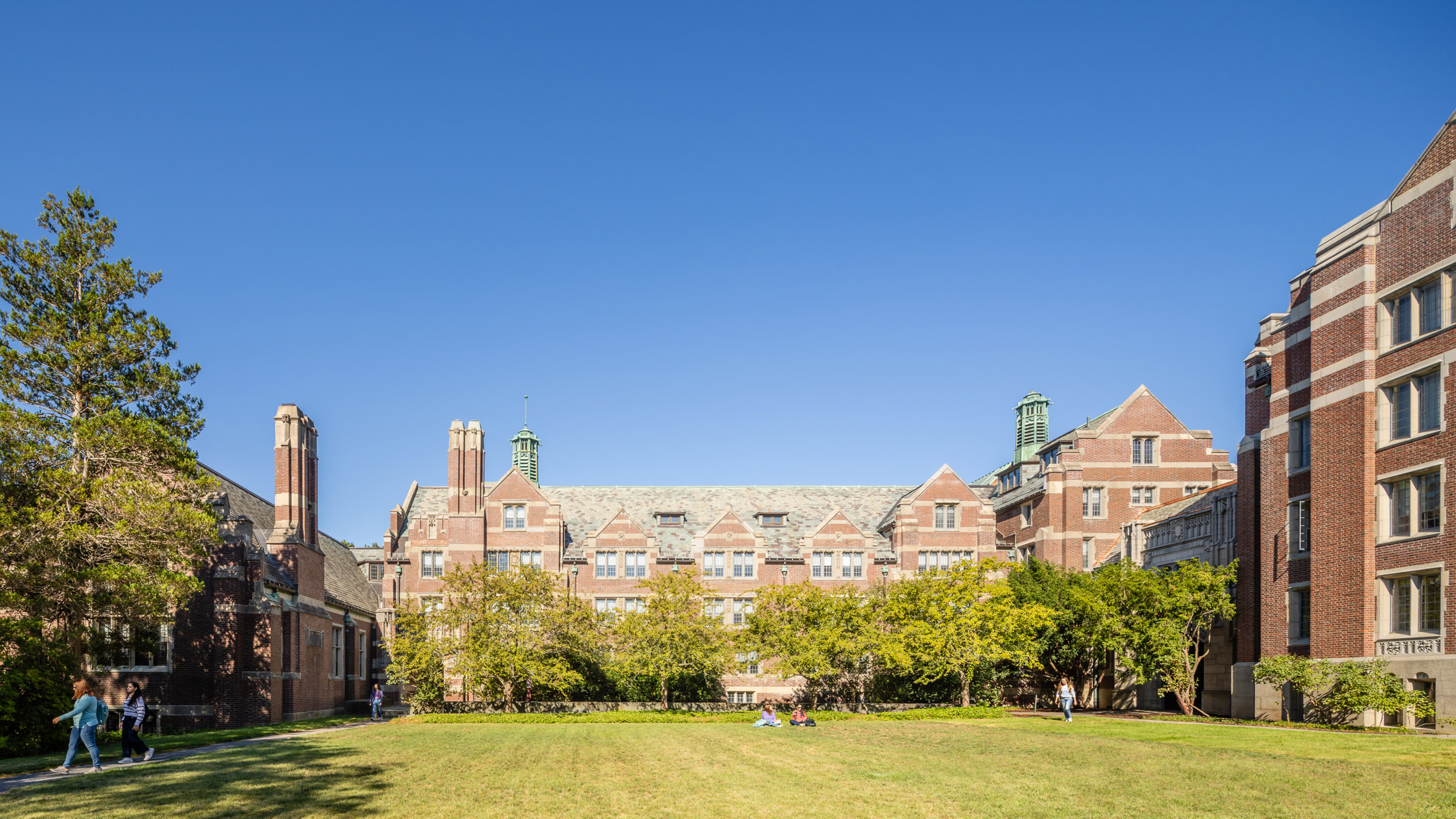
Finegold Alexander’s renovation of Pound Hall was a key part of a larger revitalization of Harvard Law School’s quad to create a campus heart. Originally design by Ben Thompson, Finegold Alexander’s design carefully and selectively demolished a third of the mid-century waffle slab building. The team then designed a new face and main entry for the building. This bold, fritted glass addition enabled the Law School to retain lecture hall spaces at the first two floors of the building, and to reprogram the upper level for departmental administrative space. It is a bold vision for the new quad designed by Michael Van Valkenburgh for the school.
(Photo credit: Neil Alexander)
Size
33,000 SF
Scope
New Façade + Renovation
Program
Multiple program spaces for the Law school, classrooms, meeting rooms, and faculty offices.
Sustainability
Awards
No items found.
In the news
No items found.
Project EUI


No items found.
.jpg)
.jpg)


No items found.
Renovations at Ben Thompson's 1970's Pound Hall involved selective demolition of a sizeable portion of the original building to create a new central courtyard for the Harvard Law School campus.


No items found.
The design team relished the challenge of working on Ben Thompson’s building without pressuring the architect’s design ideals. The contemporary curtain wall, which is glazed with fritted glass to save energy and reduce glare, closes the demolition line opening. This bold, yet respectful intervention helped the central courtyard to become the campus’ new focal point.
You may also like this


view other project categories